
Andy J, post: 377243, member: 44 wrote: Neil,
Also, and this may just be my eye, but there seems to be a space between the letters t and a in Titan. Umm, that does catch the attention!! 😉 That may be a function of the font choice, but I'm no expert on that.Andy
That that's subliminal messaging again.
Andy J, post: 377243, member: 44 wrote: Also, and this may just be my eye, but there seems to be a space between the letters t and a in Titan. Umm, that does catch the attention!! 😉 That may be a function of the font choice, but I'm no expert on that.
I thought my new knee was makin' my eyes Gee and Haw...what an what??
DDSM

Neil Grande, post: 377210, member: 8175 wrote: I created this logo a couple months ago. It looks really good on business cards but the font on the "achieved" makes it hard to see the I. So I have taken that off.
If you are using Photoshop or Illustrator, you can adjust the kerning of the characters. In fact, you can highlight specific letters or groups of letters and adjust the kerning individually. I do this sometimes when the spacing is a bit inconsistent, which is often the case with some fonts.
Like what we do here? Donate
Need a new or refreshed website? Five Point Web Solutions
Looking for a web host? Website Hosting & Management

Kerning!! I knew there was a term for that.

[USER=1]@Wendell[/USER]
Your new logo is really cool. Did you mean for it to be an optical illusion?
If you stare at it, it turns into 4 arrows!!!
Never mind I just read about it. I'm the type that relies on directions as a last resort. :whistle:
Lee D, post: 377195, member: 7971 wrote: I think you could make the firm number font a little smaller. Also possibly tuck it up a little and possibly see what right justifying it looks like vs. centered. But overall you have a really good look there.
For my letterhead, if the firm number were any smaller, I'm afraid it would become illegible.
I appreciate the constructive criticism. I'll look at changing the justification.
Totalsurv, post: 377197, member: 8202 wrote: Will the background always be black as well i.e. how will the colors work on letterheads etc. Not trying picking it apart or anything.
For my letterhead and CAD maps it black on white (and the radiating circles are gray shaded). This was for my black business cards and is part of my email signature.
Robert Hill, post: 377227, member: 378 wrote: Didn't want to get involved with the last post here about the Pendulum branding for a few reasons. But shorty after that post , I read a listing somewhere for a local emerging engineering company seeking a PR/Marketing director. The job duties were wide ranging from handling all their social media, website, trade and industry show presentations, brand development etc. It was interesting in an odd sort of way. Didn't have to
have any experience or background in engineering.Pendulum really doesn't do much for me. But if you are branding yourself for the aforementioned , I guess that it maybe catchy. I think there were some recent photos at the AR society gathering at your trade booth.
Maybe Pendulum with the graphic logo on banners and brochures would snare potential clients.
The colors are nice.
The logo suggests a phallic symbol. So 'swinging dick' could be subliminal. Check urban dictionary for pendulum.
Pendulum , pe nis, peninsula on and on. Remember No man is an Island, he's a peninsula. It does suggest a rotated male symbol too.So I would expect a lot of folks may approach you saying " how's it hanging?"
I guess the reply is "still swinging"
I don't really get the phallic reference (at least not to the graphic). Seems like a reach, but I suppose that's the thing about a graphic, it's open to interpretation. I'm not terribly concerned with urban slang. Not really my target audience.
Shawn Billings, post: 377268, member: 6521 wrote: I don't really get the phallic reference (at least not to the graphic). Seems like a reach, but I suppose that's the thing about a graphic, it's open to interpretation. I'm not terribly concerned with urban slang. Not really my target audience.
Shawn I know your market is not aware of urban slang. Neither am I TBT. But you must acknowledge archetype symbols that are acknowledge by every human on the planet.
Good luck with your enterprise.
It took me awhile to see the arrow in the FedEx logo
I definitely agree. It's helpful to have friends that look at things from a "dirty" point of view sometimes too.
[USER=6521]@Shawn Billings[/USER]
I think your logo is classy, professional looking, and eye catching.
FL/GA PLS., post: 377272, member: 379 wrote: [USER=6521]@Shawn Billings[/USER]
I think your logo is classy, professional looking, and eye catching.
Thank you. Much appreciated.
Obviously, I think that the anonymous, pseudocorporate-sounding names with no useful informational content, such as area of service or specialty, are generally intended to deceive the public and do not serve either the public or the profession very well. I get that there is an important element of self-expression in such things, but would steer away from the black velvet background that your original design has in mind.
![]()
I guess that "Timely Surveying" and "Clockwork Surveying" were already taken?
"Second Hand Surveying" probably has the wrong connotations.
In lieu of the Firm Number, why not a slogan like "When it is short, we run fast!".
Either that or "No banjos on our porch!"

Boooooo! Hissssssss!
Is this a melodrama?
Holy Cow, post: 377285, member: 50 wrote: Is this a melodrama?
Well, it seemed a bit less than polite to mention it, but, yes, it does put one in mind:

I like it Shawn. It's good feeling creating a business the way you want to create it
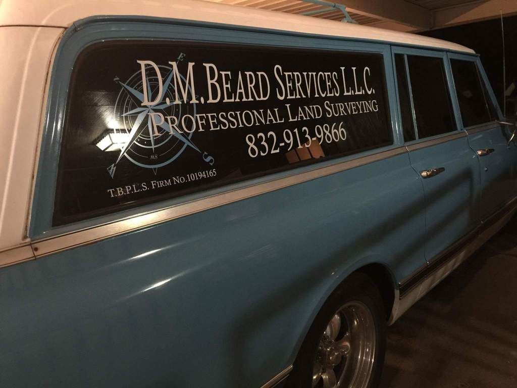
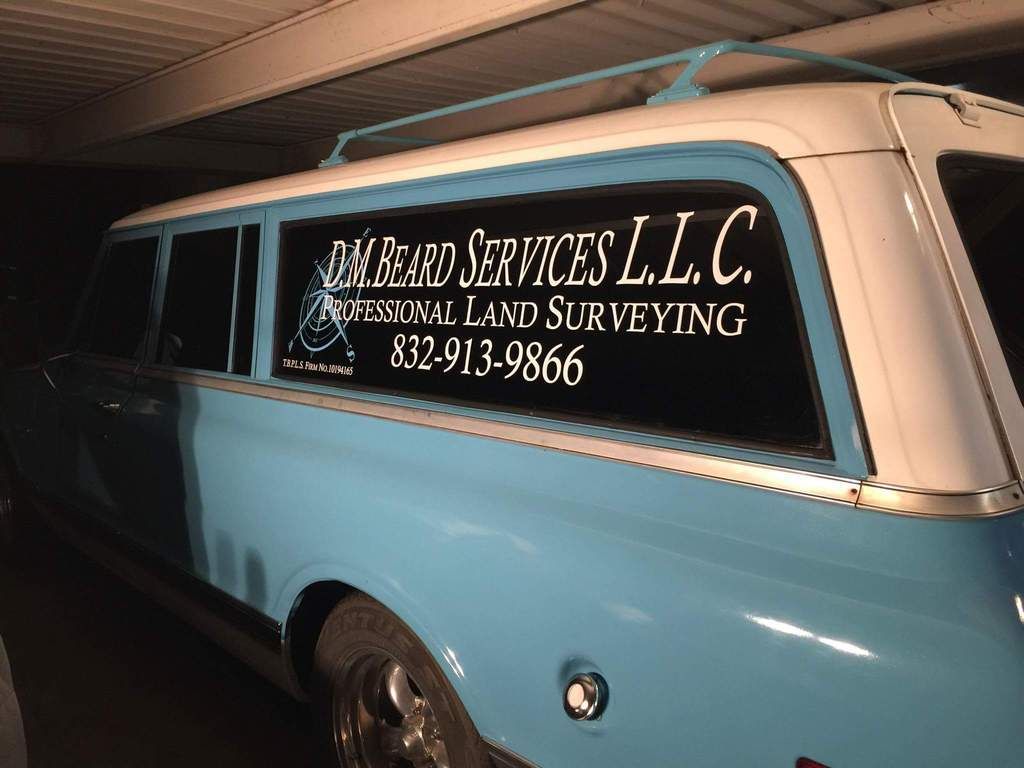
I went out on limb... and used a compass rose. Maybe it will be enough to differentiate me from the landscapers.
Darryl Beard, post: 377313, member: 11556 wrote:
Love the three door "Burb"
I went out on limb... and used a compass rose. Maybe it will be enough to differentiate me from the landscapers.
What is your ride, Darryl? Looks very classy. I'd almost trade you even for my 2003 Toyota 4-Runner I'm working out of.

Darryl Beard, post: 377313, member: 11556 wrote:
I went out on limb... and used a compass rose. Maybe it will be enough to differentiate me from the landscapers.
Nice survey wagon:good: