AI Assistant
Notifications
Clear all

Vinyl for Survey vehicle

60 Posts
24 Users
0 Reactions
1,947 Views
plumb-bill
(@plumb-bill)
Posts: 1597
Member
Translate
English
Spanish
French
German
Italian
Portuguese
Russian
Chinese
Japanese
Korean
Arabic
Hindi
Dutch
Polish
Turkish
Vietnamese
Thai
Swedish
Danish
Finnish
Norwegian
Czech
Hungarian
Romanian
Greek
Hebrew
Indonesian
Malay
Ukrainian
Bulgarian
Croatian
Slovak
Slovenian
Serbian
Lithuanian
Latvian
Estonian
 

I am definitely of the "less is more" mindset. I think the nicest and most professional thing is just the name of the company and the logo.

I don't like most logos. Think of the most recognizable companies in the world, very simple logos.

But hey, it's your business - do what you want! 🙂


Posted : August 20, 2015 12:06 pm
james-fleming
(@james-fleming)
Posts: 5732
Member
Translate
English
Spanish
French
German
Italian
Portuguese
Russian
Chinese
Japanese
Korean
Arabic
Hindi
Dutch
Polish
Turkish
Vietnamese
Thai
Swedish
Danish
Finnish
Norwegian
Czech
Hungarian
Romanian
Greek
Hebrew
Indonesian
Malay
Ukrainian
Bulgarian
Croatian
Slovak
Slovenian
Serbian
Lithuanian
Latvian
Estonian
 

Plumb Bill, post: 332740, member: 226 wrote: Think of the most recognizable companies in the world, very simple logos.

http://www.businessinsider.com/the-15-worst-corporate-logo-fails-2014-1?op=1&apos ;">The 15 Worst Corporate Logo Fails


Posted : August 20, 2015 12:24 pm
plumb-bill
(@plumb-bill)
Posts: 1597
Member
Translate
English
Spanish
French
German
Italian
Portuguese
Russian
Chinese
Japanese
Korean
Arabic
Hindi
Dutch
Polish
Turkish
Vietnamese
Thai
Swedish
Danish
Finnish
Norwegian
Czech
Hungarian
Romanian
Greek
Hebrew
Indonesian
Malay
Ukrainian
Bulgarian
Croatian
Slovak
Slovenian
Serbian
Lithuanian
Latvian
Estonian
 

James Fleming, post: 332743, member: 136 wrote: http://www.businessinsider.com/the-15-worst-corporate-logo-fails-2014-1?op=1&apos ;">The 15 Worst Corporate Logo Fails

Lol, yeah see! They weren't simple enough. 🙂


Posted : August 20, 2015 12:28 pm
peter-ehlert
(@peter-ehlert)
Posts: 2958
Member
Translate
English
Spanish
French
German
Italian
Portuguese
Russian
Chinese
Japanese
Korean
Arabic
Hindi
Dutch
Polish
Turkish
Vietnamese
Thai
Swedish
Danish
Finnish
Norwegian
Czech
Hungarian
Romanian
Greek
Hebrew
Indonesian
Malay
Ukrainian
Bulgarian
Croatian
Slovak
Slovenian
Serbian
Lithuanian
Latvian
Estonian
 

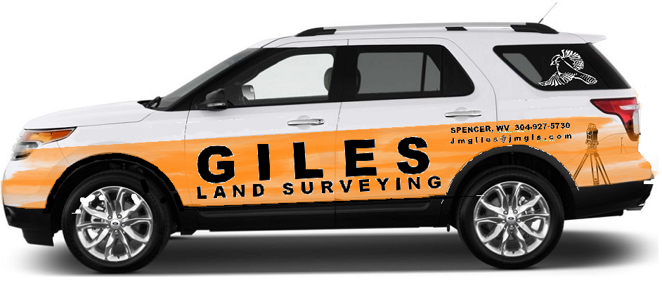
I much prefer the second Black on White design. for perspective, what we see on the computer is probably very similar to what most would see in real life, at a bit of a distance. that said: reconsider bold and the letter spacing... it tends to blur together a bit for me, especially the phone number.

trivia True Type font was invented for ease of reading in the newspapers... I always prefer it, or one of the non-copyrighted similar fonts


Posted : August 20, 2015 12:34 pm
MD Surveyor
(@md-surveyor)
Posts: 80
Member
Translate
English
Spanish
French
German
Italian
Portuguese
Russian
Chinese
Japanese
Korean
Arabic
Hindi
Dutch
Polish
Turkish
Vietnamese
Thai
Swedish
Danish
Finnish
Norwegian
Czech
Hungarian
Romanian
Greek
Hebrew
Indonesian
Malay
Ukrainian
Bulgarian
Croatian
Slovak
Slovenian
Serbian
Lithuanian
Latvian
Estonian
 

John: What did you use to create the images of your logo on the vehicles? I have been playing around with a couple of different ways to do this myself but your images are a lot cleaner than what my methods create.


Posted : August 20, 2015 12:43 pm

andy-j
(@andy-j)
Posts: 3114
Member
Translate
English
Spanish
French
German
Italian
Portuguese
Russian
Chinese
Japanese
Korean
Arabic
Hindi
Dutch
Polish
Turkish
Vietnamese
Thai
Swedish
Danish
Finnish
Norwegian
Czech
Hungarian
Romanian
Greek
Hebrew
Indonesian
Malay
Ukrainian
Bulgarian
Croatian
Slovak
Slovenian
Serbian
Lithuanian
Latvian
Estonian
 

I like the simpler style.. but then, I don't even have my company name on my truck. uber-simple.


Posted : August 20, 2015 12:43 pm
john-giles
(@john-giles)
Posts: 744
Member
Topic starter
Translate
English
Spanish
French
German
Italian
Portuguese
Russian
Chinese
Japanese
Korean
Arabic
Hindi
Dutch
Polish
Turkish
Vietnamese
Thai
Swedish
Danish
Finnish
Norwegian
Czech
Hungarian
Romanian
Greek
Hebrew
Indonesian
Malay
Ukrainian
Bulgarian
Croatian
Slovak
Slovenian
Serbian
Lithuanian
Latvian
Estonian
 

MD Surveyor, post: 332749, member: 10081 wrote: John: What did you use to create the images of your logo on the vehicles? I have been playing around with a couple of different ways to do this myself but your images are a lot cleaner than what my methods create.

I use http://support.uscutter.com/index.php?/Knowledgebase/Article/View/19/5/download-signblazer-software&apos ;">signblazer It came with my vinyl cutter and works pretty good.


Posted : August 20, 2015 1:14 pm
scott-ellis
(@scott-ellis)
Posts: 1181
Member
Translate
English
Spanish
French
German
Italian
Portuguese
Russian
Chinese
Japanese
Korean
Arabic
Hindi
Dutch
Polish
Turkish
Vietnamese
Thai
Swedish
Danish
Finnish
Norwegian
Czech
Hungarian
Romanian
Greek
Hebrew
Indonesian
Malay
Ukrainian
Bulgarian
Croatian
Slovak
Slovenian
Serbian
Lithuanian
Latvian
Estonian
 

You should wrap in it FLO Orange as the background color with the 2nd design graphics. It can be a loud billboard yet simple. However I would not want to be see in a flo orange truck.


Posted : August 20, 2015 1:52 pm
summerprophet
(@summerprophet)
Posts: 471
Member
Translate
English
Spanish
French
German
Italian
Portuguese
Russian
Chinese
Japanese
Korean
Arabic
Hindi
Dutch
Polish
Turkish
Vietnamese
Thai
Swedish
Danish
Finnish
Norwegian
Czech
Hungarian
Romanian
Greek
Hebrew
Indonesian
Malay
Ukrainian
Bulgarian
Croatian
Slovak
Slovenian
Serbian
Lithuanian
Latvian
Estonian


Posted : August 20, 2015 5:11 pm
john-giles
(@john-giles)
Posts: 744
Member
Topic starter
Translate
English
Spanish
French
German
Italian
Portuguese
Russian
Chinese
Japanese
Korean
Arabic
Hindi
Dutch
Polish
Turkish
Vietnamese
Thai
Swedish
Danish
Finnish
Norwegian
Czech
Hungarian
Romanian
Greek
Hebrew
Indonesian
Malay
Ukrainian
Bulgarian
Croatian
Slovak
Slovenian
Serbian
Lithuanian
Latvian
Estonian
 

There you go. Plenty of orange. I could ride around i something like that.


Posted : August 20, 2015 5:58 pm

holy-cow
(@holy-cow)
Posts: 25672
Member
Translate
English
Spanish
French
German
Italian
Portuguese
Russian
Chinese
Japanese
Korean
Arabic
Hindi
Dutch
Polish
Turkish
Vietnamese
Thai
Swedish
Danish
Finnish
Norwegian
Czech
Hungarian
Romanian
Greek
Hebrew
Indonesian
Malay
Ukrainian
Bulgarian
Croatian
Slovak
Slovenian
Serbian
Lithuanian
Latvian
Estonian
 

Make sure you or any crew don't park it anywhere near a "gentlemen's club" or anything similar. 😉

Had to say that as I drove past one of those twice today, plus a XXX Adult Video Store, a good sized casino and the construction site for another casino. And, I was within a quarter mile of my ex-wife's house. Any of those could get me in trouble with someone.


Posted : August 20, 2015 6:31 pm
peter-ehlert
(@peter-ehlert)
Posts: 2958
Member
Translate
English
Spanish
French
German
Italian
Portuguese
Russian
Chinese
Japanese
Korean
Arabic
Hindi
Dutch
Polish
Turkish
Vietnamese
Thai
Swedish
Danish
Finnish
Norwegian
Czech
Hungarian
Romanian
Greek
Hebrew
Indonesian
Malay
Ukrainian
Bulgarian
Croatian
Slovak
Slovenian
Serbian
Lithuanian
Latvian
Estonian
 

first glance: Creamsicle!


Posted : August 20, 2015 8:39 pm
party-chef
(@party-chef)
Posts: 987
Member
Translate
English
Spanish
French
German
Italian
Portuguese
Russian
Chinese
Japanese
Korean
Arabic
Hindi
Dutch
Polish
Turkish
Vietnamese
Thai
Swedish
Danish
Finnish
Norwegian
Czech
Hungarian
Romanian
Greek
Hebrew
Indonesian
Malay
Ukrainian
Bulgarian
Croatian
Slovak
Slovenian
Serbian
Lithuanian
Latvian
Estonian
 

http://www.dunnautographics.com/dunn_frames.htm

Here is a guy from WA, I like his work, although he does not highlight his trucks much on the website, maybe there is someone in your area that can help.

One of my main pet peeves about signage is the one size fits all approach where people have a business card that they just scale up and down for whatever without taking things in context.


Posted : August 21, 2015 6:06 am
MD Surveyor
(@md-surveyor)
Posts: 80
Member
Translate
English
Spanish
French
German
Italian
Portuguese
Russian
Chinese
Japanese
Korean
Arabic
Hindi
Dutch
Polish
Turkish
Vietnamese
Thai
Swedish
Danish
Finnish
Norwegian
Czech
Hungarian
Romanian
Greek
Hebrew
Indonesian
Malay
Ukrainian
Bulgarian
Croatian
Slovak
Slovenian
Serbian
Lithuanian
Latvian
Estonian
 

Actually, if you remove the orange I think I like that design the best. It's kind of in the middle of the first two designs you posted.


Posted : August 21, 2015 6:07 am
james-fleming
(@james-fleming)
Posts: 5732
Member
Translate
English
Spanish
French
German
Italian
Portuguese
Russian
Chinese
Japanese
Korean
Arabic
Hindi
Dutch
Polish
Turkish
Vietnamese
Thai
Swedish
Danish
Finnish
Norwegian
Czech
Hungarian
Romanian
Greek
Hebrew
Indonesian
Malay
Ukrainian
Bulgarian
Croatian
Slovak
Slovenian
Serbian
Lithuanian
Latvian
Estonian
 

Holy Cow, post: 332799, member: 50 wrote: Make sure you or any crew don't park it anywhere near a "gentlemen's club" or anything similar. 😉


Posted : August 21, 2015 6:31 am

j-t-strickland
(@j-t-strickland)
Posts: 484
Member
Translate
English
Spanish
French
German
Italian
Portuguese
Russian
Chinese
Japanese
Korean
Arabic
Hindi
Dutch
Polish
Turkish
Vietnamese
Thai
Swedish
Danish
Finnish
Norwegian
Czech
Hungarian
Romanian
Greek
Hebrew
Indonesian
Malay
Ukrainian
Bulgarian
Croatian
Slovak
Slovenian
Serbian
Lithuanian
Latvian
Estonian
 

John,
I prefer your subdued design.
Also, since you're asking, The area code looks bigger than your phone number, and makes the number more difficult to read.
Since most people are accustomed to the area code, I would tend to shrink it some and expand the main number.
It may just be the way I'm looking at it, though.


Posted : August 21, 2015 6:59 am
john-giles
(@john-giles)
Posts: 744
Member
Topic starter
Translate
English
Spanish
French
German
Italian
Portuguese
Russian
Chinese
Japanese
Korean
Arabic
Hindi
Dutch
Polish
Turkish
Vietnamese
Thai
Swedish
Danish
Finnish
Norwegian
Czech
Hungarian
Romanian
Greek
Hebrew
Indonesian
Malay
Ukrainian
Bulgarian
Croatian
Slovak
Slovenian
Serbian
Lithuanian
Latvian
Estonian
 

Here is one like summerprofit made with smaller area code and all in black. I kept my motto. I have it all on all my plats so I should put it on my vehicle.


Posted : August 21, 2015 8:52 am
scott-ellis
(@scott-ellis)
Posts: 1181
Member
Translate
English
Spanish
French
German
Italian
Portuguese
Russian
Chinese
Japanese
Korean
Arabic
Hindi
Dutch
Polish
Turkish
Vietnamese
Thai
Swedish
Danish
Finnish
Norwegian
Czech
Hungarian
Romanian
Greek
Hebrew
Indonesian
Malay
Ukrainian
Bulgarian
Croatian
Slovak
Slovenian
Serbian
Lithuanian
Latvian
Estonian
 

Okay now that we got your phone number fixed lets address the email address, I can tell its @jmgl.com but it also looks likes @imgl.com and it might be easier to read if you can make a [email protected]


Posted : August 21, 2015 8:57 am
john-giles
(@john-giles)
Posts: 744
Member
Topic starter
Translate
English
Spanish
French
German
Italian
Portuguese
Russian
Chinese
Japanese
Korean
Arabic
Hindi
Dutch
Polish
Turkish
Vietnamese
Thai
Swedish
Danish
Finnish
Norwegian
Czech
Hungarian
Romanian
Greek
Hebrew
Indonesian
Malay
Ukrainian
Bulgarian
Croatian
Slovak
Slovenian
Serbian
Lithuanian
Latvian
Estonian
 

Here is a logo I've been working on, off and on for a couple years. Any artists out there? It's supposed to be GLS showing a walking person to signify 'in there footsteps' But I'm no closer to getting the 'G' any better than I was two years ago. I wanted this to be my new logo.


Posted : August 21, 2015 9:55 am
summerprophet
(@summerprophet)
Posts: 471
Member
Translate
English
Spanish
French
German
Italian
Portuguese
Russian
Chinese
Japanese
Korean
Arabic
Hindi
Dutch
Polish
Turkish
Vietnamese
Thai
Swedish
Danish
Finnish
Norwegian
Czech
Hungarian
Romanian
Greek
Hebrew
Indonesian
Malay
Ukrainian
Bulgarian
Croatian
Slovak
Slovenian
Serbian
Lithuanian
Latvian
Estonian
 

John,
I would suggest working with your vinyl guys and come up with a design.

Purely from a stylistic standpoint, you with many text heights, text types, and not following the bodylines of the vehicle, you end up with a discontinuous appearance to the vehicle. Frankly it looks like you had your company name done, then decided to add your phone number at a later date,.... then later added your email address..... and so on and so on.

By nature, surveyors are more left brained than right brained, I would suggest you seek out the artsy creative types for your vehicle endeavor.

(And your proposed logo is killing me...... I could only support it if you were my direct competition)


Posted : August 21, 2015 10:05 am

Page 2 / 3