Maynard Dixon
Kent I really like the windmill. I like the perspective. I like them all but that one caught my eye.
I do agree with you that your art and drawing a map are not the same by far. My only point was art is one of those words that is attached to and interpreted to take many forms of creativity.
Merry Christmas
Maynard Dixon
> My only point was art is one of those words that is attached to and interpreted to take many forms of creativity.
Well, if we call it "graphic design", I'll agree. Most boundary survey maps need to present the same basic information, but figuring out how to do it efficiently and compactly, while also in a way that is clear and as easily intelligible as possible, is a design problem with a variety of solutions, some much better than others.
DDSM
It was Foster. On a survey down on the east side of Delight AR.
Nate
No- that is an expoded view of the KM north arrow...
It must be the season
but that sounded almost conciliatory.
Don
It must be the season
> but that sounded almost conciliatory.
Well, once you think of the methods of presenting information via maps as a problem in graphic design, it actually brings you in line with my views, which are that needless decoration works against efficient communication and is therefore poor graphic design.
In other words, the test isn't "is it pretty?", but "does it communicate efficiently?", which the Rube-Goldberg-looking folk-art North arrows consistently fail.
Don took Poison
Just so you know.
I suppose that was his way of ending the dialogue.
His last communication was to ask me to let you all know that he enjoyed your company and that he should have known better than to disagree with Kent.
Thank you,
The brother- in- law of Don
Don took Poison
> Just so you know.
> I suppose that was his way of ending the dialogue.
Well, when I saw he and that Karoly fellow were swapping favorite brands of absinthe, I knew that nothing good would come of it. Not everyone has the Karoly liver.
Don took Poison
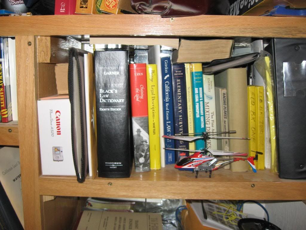
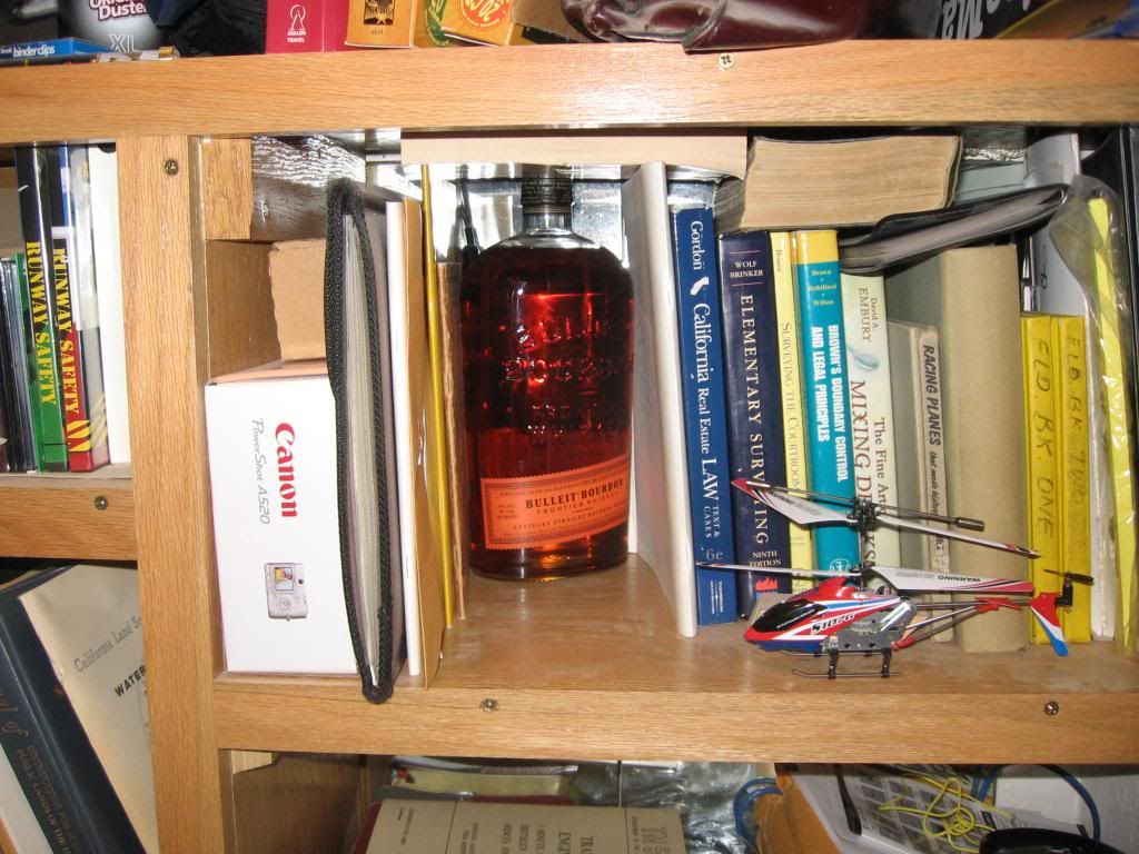
An ordinary Land Surveyor's bookshelf...
Black's Law Dictionary is actually useful for something...
The Cat Wrecked the Helicopter
When he hung up the phone, Dave Marlowe reached without looking for his copy of Black's Law Dictionary. His client had said some things that didn't sound quite right, but he figured that if it hadn't made its way into Black's, it probably meant that the contrary could be proven and there was wiggle room. The contrary in this case was a bottle of bootleg whiskey that his hand found where the spine of the law dictionary should have been. Most likely his daughter the law student had liberated the dictionary, leaving only the spine of the book and a bottle of cheap whiskey to ease the loss of his entire law library.
He was about to say something when his cat's helicopter flew past him loaded with primo catnip and crashed into the shelf where the dictionary would have been had it not gone somewhere else with his daughter.
The real problem I have with all this
is that I philosophically agree with Kent. A perdy north arrow, cannot compensate for bad, or poor data. Even poor presentation.
So, I began thinking about it. Lipstick on a pig. (Perfume on a party chief, assuming of course, he also has a beard)
It is a form of obfuscating. A pretty plat, done with autocad, and it is not to be trusted.
But, since there are folks out there DOING JUST THAT, I like to put a north arrow on it, that indicates attention to detail. Beat them at their own game. If you cannot fight them, join them. BUT NOT IN BAD DATA.
I feel that Kent would be embarrassed if he were beat in court, with a competitors plat, that was all ink, and no proper monuments, and the Competitor beat him, because the Judge was not impressed with his north arrow. Now, we as surveyors know the difference. But, the Jury, or Judge, may not figure out the obfuscation mechanism, when the Attorneys and General public are not well educated.
I have had MANY occasions where a client proudly brought out a Craftsman Dumpy Level, in a dusty wood box, and was PROUD of his survey instrument. Useless for real horizontal surveying. Also, on Ebay, this ignorance of what things are worth shows, when folks try to sell a Bostrom Brady Farmer's level for $500.
When you go to a car lot, those cars will be washed, waxed, and made to look their best. Regardless if they are good cars or not.
So, I say win in both environments. Maybe they bought your plat because it was pretty. So what. I don't care. They bought my plat. I got paid. A truthful plat, done on construction paper, with crayon is worth more than a fine plat, on vellum with bogus data. We know that. The public does not. So, why go ugly? Update your computer habits, and learn to move forward. Color plats and all.
Truth counts.
The ugly truth is always better than the best dressed lie.
But, a well dressed truth, that is easy on the eyes. It is not just nice for a surveyor. It is nice for Mrs. Golden at the Real Estate office, when she goes to show the property.
Ladies that sell real estate, tend to spruce up, when they go to sell.
So does Mr. Hardy, in his 3 pc suit, and his C5 Blazer, all cleaned up, and waxed, and perdy.
And, I spruce my plats up too.
That's my story, and I am sticking to it.
Nate
The Cat Wrecked the Helicopter
I needed a swig from the bottle of Old Forester I keep in the old transit box after talking to Miss Leggs about the twisted half inch rebar behind Johnson's barn she thinks gives her a claim to Johnson's cistern.
The real problem I have with all this
Ya want purdy? Well, don't line up a column of text or numbers so that they don't line up vertically. Professionally, it is harder to read and figure out, and secondly it looks sloppy. If you can't make an easy-to-read plat, you probably don't pay much attention to details.
Don't misspell your words. Same reasons as above. I would be concerned with the authors ability to write a good legal description if they can't spell correct, or don't know the correct usage of some words.
Don't have linework going through bearings and/or distances or any important text. It can change the numerical value or make it impossible to read.
Don't have text or numbers that are too small for the weight of the text and even if it's proportionate, don't make the reader get a magnifying glass in order to read it. Yes, it's nice to fit it all on one page if it's legible, but use two pages if that's what is necessary to present your data.
Know the purpose of the map, and make that information stand out more than unnecessary information.
And yes, make a north-arrow clear for the intended purposes. You should know which way north is, and the line should be clear and easy to use for the guy reading and utilizing your map.
I get the north-arrow issue. For some; a cool, original, design of an arrow is a kind of "signature". The one place where a little creativity might take place. but not too fancy to be useful. And definitely not 'gaudy'.....
Maynard Dixon
Very nice paintings Kent.
Maynard Dixon
> Very nice paintings Kent.
Thanks. I gave prints of some of them, including two of the same windmill, to a client who has a ranch and, while he liked them all, the main thing that struck him about the windmill that was missing some boards on the platform was that it was ... missing some boards on the platform. He said if I ever wanted to replace them (it was his windmill), I was welcome to do it. :> I didn't tell him that one of the interesting parts of that windmill were exactly those missing boards.
Very nice paintings, Kent. I enjoyed the entire discussion really. The part where the cat wrecked the helicopter was quite enchanting. I would ask, "Are you going to drink that or just write about it?"
Surveying is both an art and a science. Sometimes we want to leave our mark but I would agree that "over-arting" your clients' only tangible product is unnecessary.
This is a pretty good site where you don't get beat up anytime you disagree.
John Giles
I still am an amateur on autocad/Carlson. Your plats are VERY nice.
Nate


