[USER=6521]@Shawn Billings[/USER]
I think your logo is classy, professional looking, and eye catching.
FL/GA PLS., post: 377272, member: 379 wrote: [USER=6521]@Shawn Billings[/USER]
I think your logo is classy, professional looking, and eye catching.
Thank you. Much appreciated.
Obviously, I think that the anonymous, pseudocorporate-sounding names with no useful informational content, such as area of service or specialty, are generally intended to deceive the public and do not serve either the public or the profession very well. I get that there is an important element of self-expression in such things, but would steer away from the black velvet background that your original design has in mind.
I guess that "Timely Surveying" and "Clockwork Surveying" were already taken?
"Second Hand Surveying" probably has the wrong connotations.
In lieu of the Firm Number, why not a slogan like "When it is short, we run fast!".
Either that or "No banjos on our porch!"
Boooooo! Hissssssss!
Is this a melodrama?
I like it Shawn. It's good feeling creating a business the way you want to create it


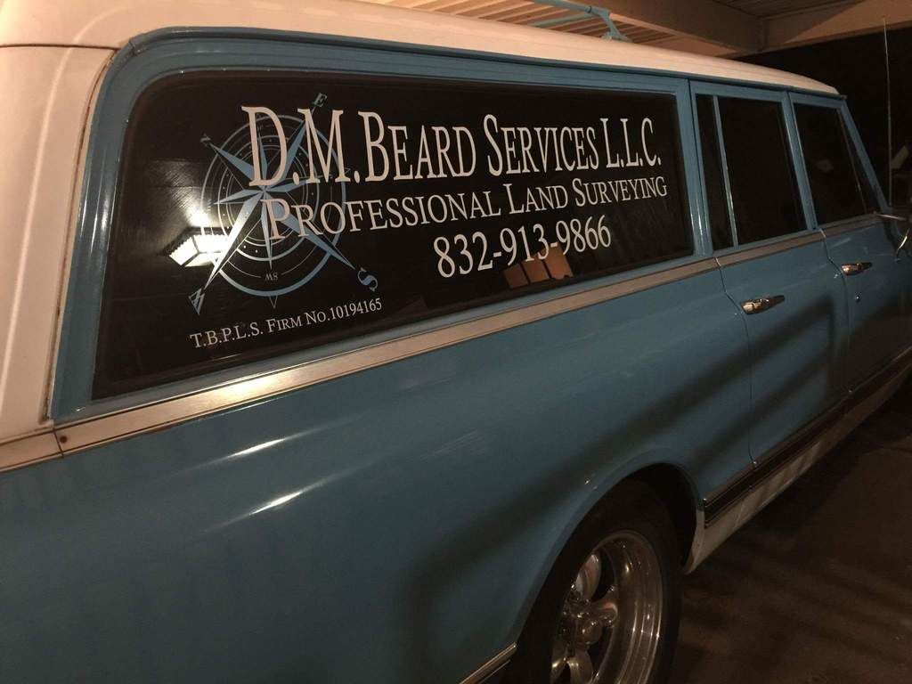
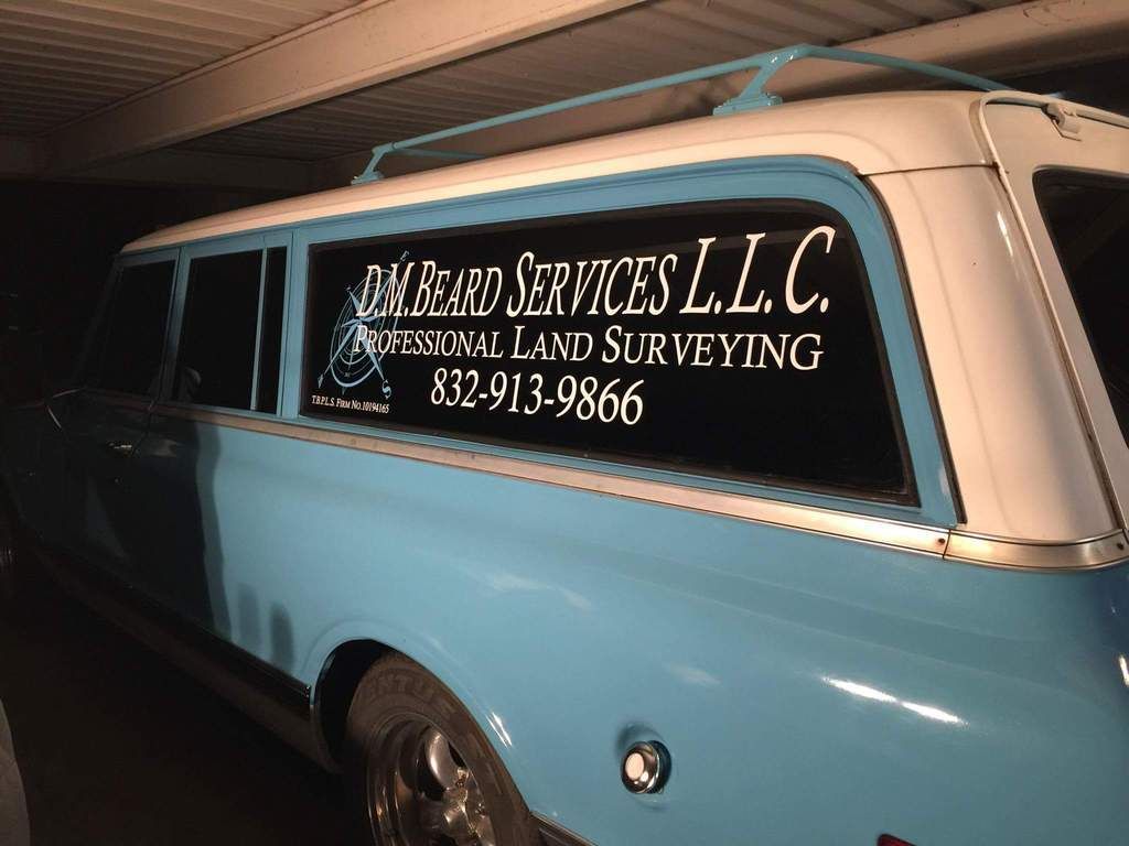
I went out on limb... and used a compass rose. Maybe it will be enough to differentiate me from the landscapers.
Darryl Beard, post: 377313, member: 11556 wrote:
Love the three door "Burb"
I went out on limb... and used a compass rose. Maybe it will be enough to differentiate me from the landscapers.
What is your ride, Darryl? Looks very classy. I'd almost trade you even for my 2003 Toyota 4-Runner I'm working out of.
Darryl Beard, post: 377313, member: 11556 wrote:
I went out on limb... and used a compass rose. Maybe it will be enough to differentiate me from the landscapers.
Nice survey wagon:good:
I too used my name as corporate "logo". This was in 1988 when naming a business after yourself was "in". I haven't changed my logo since the initiation of the business but today I wish I had.
A professionally designed, or self designed, logo is the way to go today. Shawn Billings and Brad Ott's logos are an example. Todays public is more apt to choose a firm with an eye catching, colorful and classy logo than say Sam Smith Surveying. A logo such as the aforementioned purports establishment, thus conveying a corporate image which is more conducive to public attraction.
The general public is cognizant that a corporation with a logo is more conducive to deal with than Joe's Surveying Services.
Had I not been in business so long I would definately change my corporate name.
Just my 00.200 worth. (anything over a foot or two needs closer examination 😉
[USER=6521]@Shawn Billings[/USER]
Your logo would really look good on a clean black truck!
I do like my logo, but this picture of it doesn't show that the plumb bob is actually pointing to my house. 🙂 I used the old transit image because that's what people think of when they think of surveying, not the newer instruments we use, plus the name is a local historical reference.
Here it is on the rig, the sign maker didn't get the plumb bob in the right place, but only I know that, and all you now!
Shawn Billings, post: 377318, member: 6521 wrote: What is your ride, Darryl? Looks very classy. I'd almost trade you even for my 2003 Toyota 4-Runner I'm working out of.
She is a 1972 Chevy Suburban. I decided to put it to work because it gets a lot more attention than my 2015 Silverado.
The A/c is currently not working so she is not that much fun to drive right now... I should have that remedied by the weekend though.
Darryl Beard, post: 377313, member: 11556 wrote:
I went out on limb... and used a compass rose. Maybe it will be enough to differentiate me from the landscapers.
Now that's a survey wagon


.jpg)


