So I have a proposed surface (or at least the contours so the surface model can be created) and the existing surface. I go to the volume menu and pick the existing as the base and the proposed as the comparison and it gives me the volume of the cuts, fills, and net fill. I can export the report and everything but it would be helpful to show this to some people visually.
Is there a way to get this volume information to display graphically on the screen or a plot?
I know I have shown slope analysis on a surface using different colors for areas where the slope exceeded a certain amount, so I would like to do something like that where the fills exceed a certain amount. Any help would be appreciated.
James Fleming, post: 343102, member: 136 wrote: The good news is yes, there is a way to do it
The bad news is my CAD Manager did it for me a few years ago and I have no idea how he did it :snarky:
Well thanks.....I had a feeling it COULD be done....now I need to figure out how. There's a tool that shows the minimum distances between surfaces. In this case it draws lines where they intersect, so clearly the analysis capability is there....
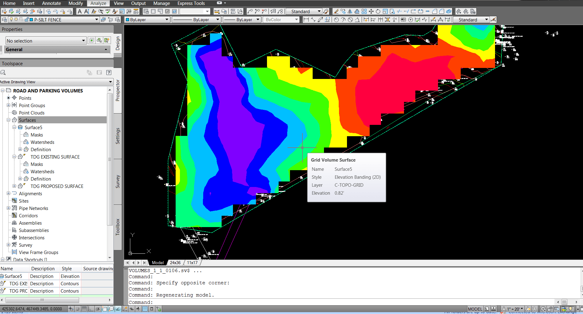
Got it! You have to create a third surface which is a volume type surfaces. Then you can display it by different colors according to the difference between the surfaces.

This is without messing with it at all, so I am sure I will have to tweak a few things.
Dan Patterson, post: 343101, member: 1179 wrote: So I have a proposed surface (or at least the contours so the surface model can be created) and the existing surface. I go to the volume menu and pick the existing as the base and the proposed as the comparison and it gives me the volume of the cuts, fills, and net fill. I can export the report and everything but it would be helpful to show this to some people visually.
Is there a way to get this volume information to display graphically on the screen or a plot?
I know I have shown slope analysis on a surface using different colors for areas where the slope exceeded a certain amount, so I would like to do something like that where the fills exceed a certain amount. Any help would be appreciated.
I have no experience with C3D, so I can't speak for that. I do know that Carlson Civil/Survey has the exact functionality you're referring to, called a Cut/Fill Color Map, that I use all the time to show landfill volume & subsidence. Knowing how robust C3D is, I couldn't imagine it not having something similar, hopefully just buried in the menus somewhere.
Sorry couldn't offer any real help.
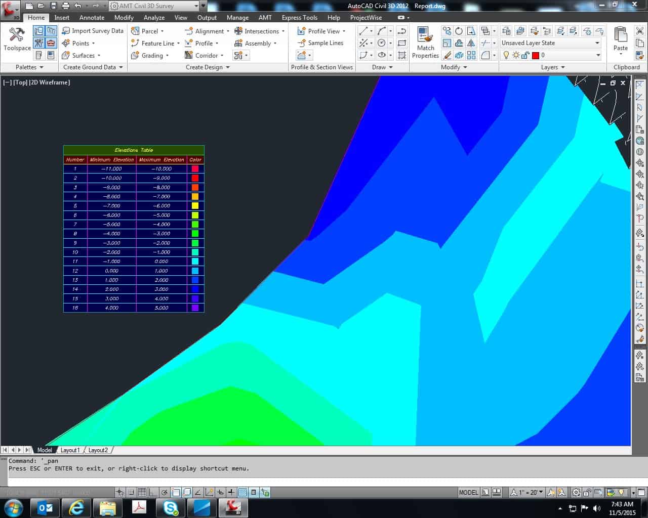
I found it....see above. It's called volume surface which is a type of surface. You can select the base surface and comparison surface in the properties and then it displays the colors based on the surface differential. See screenshot.
Dan, what the routine is doing is creating a surface model, where the elevations represent the difference between the two surfaces.
If you contour that model, you will end up with isopach contours (depth contours). You will typically see these contours on topographic maps of the ocean.
Very handy for landfill closures, where you may want to demonstrate areas that either lack sufficient cover, or have excessive cover.
That sounds pretty cool. What I did was set the style to elevation banding and then changed the ranges to 0.5' increments. In the image above the purple region requires between 1.5-2' of fill then steps down by half foot increments. They're called "elevations" in the software, but apparently or at least what I am assuming they are is the differential between the two surfaces.
Yup, it's shading between isopach contours.
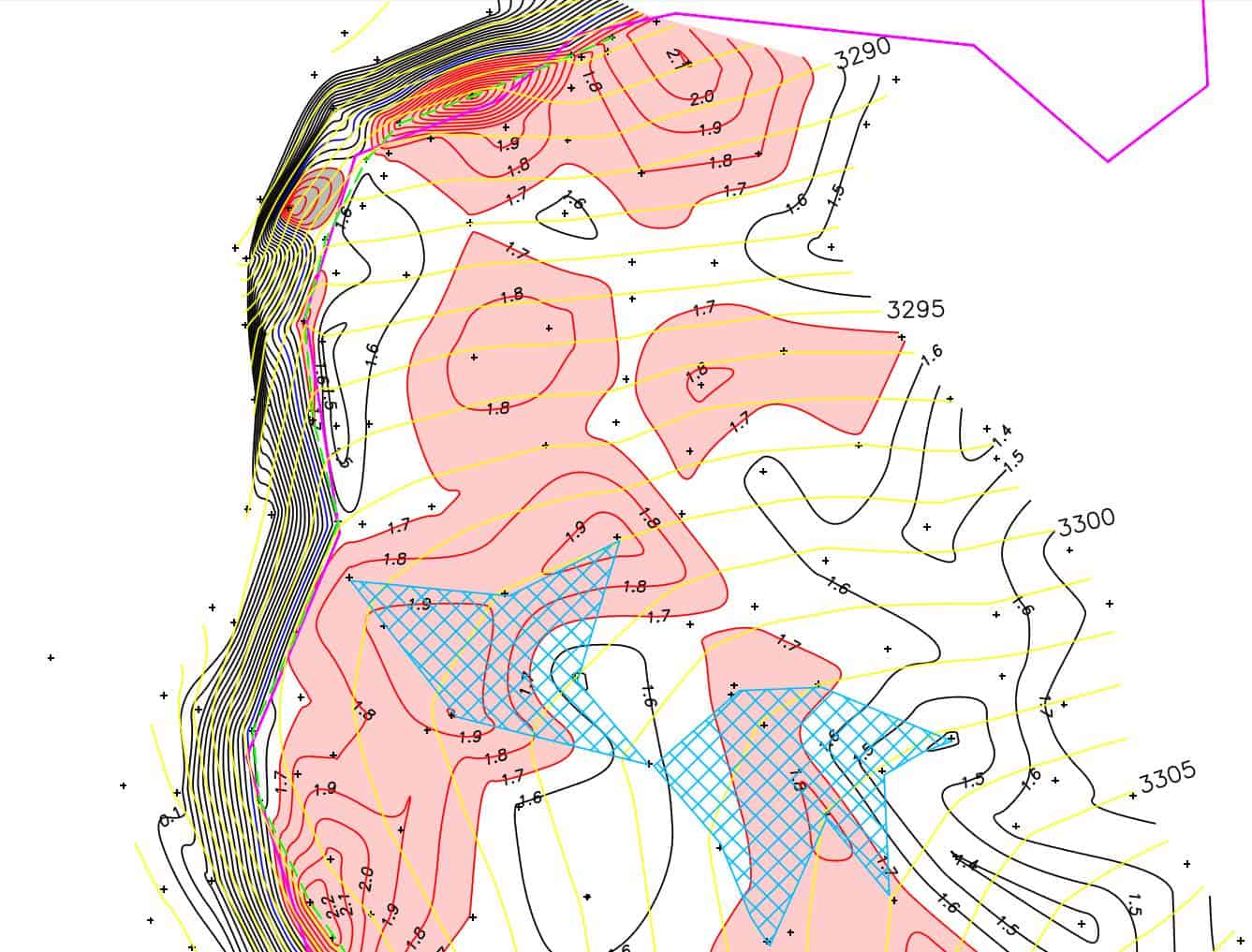
Here is a screen shot of a map I generated back in 2003 (I may have been using Pacsoft at the time).
The yellow lines are the as-built contours. The lines under those are isopach contours.
The red shading is areas where the cover depth exceeds the min. required.
The blue hatch is areas where the slope is flatter than the min.
So in this instance the map is showing that the contractor has enough cover to re-grade the slope to improve the drainage near one of the flat areas.
Tremendously useful for large grading operations. Print the map as a geo PDF and walk around with your smart phone to locate the general areas that require additional grading.
That's pretty cool


